It is important that I share my work that does not come out as planned as well as the work I am happy with. Let’s face it, for every good piece of work, artists (I know this is true for myself) make a few crappy ones. Sometimes I just rework the same thing and other times I abandon the idea altogether or just put it on pause. Below is a print that did not come out the way I had planned and I will talk about how it came to be and why I think it basically is not so hot.
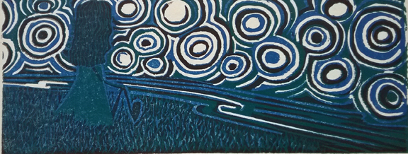
The original idea for this is pretty much as pictured, a girl sitting on a hill over a stream looking at a big starry sky. The other things this work originally was going to include were a full moon, then a crescent moon, and a cat. But for some reason, I removed the cat and made a different piece of work with a cat. But that is another story. So I decided the focus should be on the girl.
I also wanted to do a reduction linocut, which is a way to print in color. It has been a long time since I have made one and I wanted to see if I could still register my blocks properly. So what is wrong with this print? Basically, it is too dark. The one I photographed is a bit lighter but in the majority of them the ink is even darker than the one pictured. So I decided to add some hand coloring to see if that perked it up.

It did perk it up a bit but not enough to my liking. So now what? Basically, I love problems like this. I will probably make this piece again as a drawing but I may also cut it again and print it in lighter colors.
The point is this: failure is a great thing. Making art is problem solving. My thoughts are lighter colors but if this was your work, what would you change?

I don’t know enough about this really to make a comment but I do wonder if there’s a way to make the girl’s image more of a contrast. I really like the design of the sky. I’d take a piece of fabric with that design on it any day!
LikeLike
Hi Alice. Yes, if I re cut the block, I could print the girl’s image with lighter colors. The way a reduction print is done means there is no going back because with each layer of color, you carve away the block more (reducing the block). At some point I will put up a tutorial on this method. As far as the sky, thank you! Maybe when this blows over we can make a block with the design and print it on fabric.
LikeLike
I like the sky in both instances. I think the girl is too top heavy. Too much head for her body. I love the lack of contrast between her and the sky as I think it emphasizes their oneness. And what rich colors. I applaud you for doing reduction printing. That’s so hard.
LikeLiked by 1 person
Thanks Claudia. I see what you mean about the head and it is especially pronounced because the space is so narrow. Thank you very much for pointing that out.
LikeLike
I love the whole concept of a small person in the midst of so much space and sky, and yet the oneness of them.
LikeLiked by 1 person
Nothing! As you well know … I can barely draw a straight line with a ruler. Actually, I like both. But to pick one to display, the print with more colors … just because I’m me.
LikeLike
Hi Nellie, Actually, they will both go (all 16 of them) into the scrap pile. There is lots of other problems with it besides the color issue but the color issue is the main thing. I absolutely agree that adding that brighter color brings more to the table. I am looking forward to tackling this problem.
LikeLike
Diane, I think this is the most successful failure I’ve ever seen! I love the sky also, especially the way the river sets it off.
But I am completely stumped about what the girl is holding. I thought first of a broken golf club and now I’m stuck on that mental image.
LikeLike
Well I actually like the idea of a broken golf club! She is holding onto her knees, sitting bent leg. It is not reading well as it is. The one thing that is getting lots of attention is the sky so at least I have that part figured out.
LikeLike
I see it now! Thanks!
LikeLiked by 1 person