Attired in a new silk dress, adorned with her signature string of pearls, Harriet the Elegant ghost takes her seat by the radio awaiting the overture to begin.

Attired in a new silk dress, adorned with her signature string of pearls, Harriet the Elegant ghost takes her seat by the radio awaiting the overture to begin.

I enjoy reading Haiku because the length matches my attention span. In going through some old notebooks, I came across two Haiku that I wrote during this time of year so I am sharing them below.
Oct. 1997
Ghosts, goblins stirring
through the moaning thick of night,
come daylight – vanished!
November, 1997
The crisp air turns cold
and settles into winter
when harvest is done.
Outraged by the parking situation because of inconsiderate consumers, Harriet the Elegant ghost spent an afternoon collecting and returning shopping carts at a local strip mall.


If this looks a bit familiar it is because you may have received a similar post recently that did not load quite right so I took it down to fix and hopefully this one works. Below is a very short video of an Artist Book I made call Neighborhoods. It was made from a 12″ x 12″ piece of paper and the imagery came mostly from a drypoint (engraving) I made specifically for this purpose. I combined the cut up drypoint prints with other media and here is the final book. Click on the still image below to start the video. If you do not see an image, give it a second to load up. Much thanks!

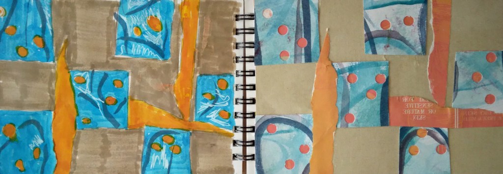
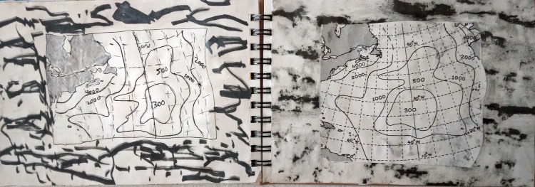
I had stopped making the Paper Quilt Collages that I was working on a few months ago. I enjoyed the drawing aspect of it, but making the paper quilts appealed to me less. After thinking about it I realized that it was the structure of trying to make the collage quilt-like that I no longer enjoyed. I liked the collage element and especially drawing the finished collage. I made a few more anyway with quilting in mind because I had some materials I thought would go with that theme, then I focused less on the quilt aspect. To recap, the collages are on the right and the drawings are on the left. Right clicking the image will open it in another window so it can be seen better.
The first few of these are more in the style of the non-traditional Gees Bend Quilts. The materials are: bar codes and insides of envelopes. To recap, using materials from whatever was handy (out of necessity) was part of the Gees Bend way of making quilts

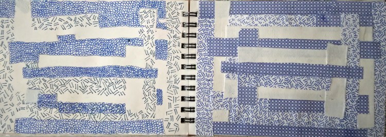
The next few are also quilt like but they are more in the traditional quilt style of squares. The blue and orange one is from a torn up painting. The black and white one, which is a favorite, is from a very old textbook on weather. The collage images are magnified views of ice crystals. It was especially fun trying to draw this because the challenge was making marks that mimicked the variety of the ice crystal images.

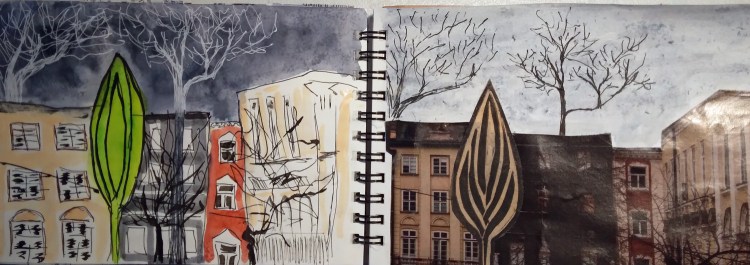
Now these last two are of no reference at all to quilts. They are just collages I made then drew.
Some time ago, I wrote about our family summer house when I was growing up and asked each of my sisters and brother to draw their recollections of it. On a similar note, I asked each of them if they remembered what became known as The King’s Dining Room.
We lived in a row house, a very old brick construction common in industrial cities before and up to World War II. The closets in these homes were very small for two reasons: people did not have many clothes and, at one point, closets were taxed as extra rooms. (I will add a side note here that the closet tax was more during colonial times but it does not surprise me this mentality persisted because not all that long ago, my art club had to disconnect a dumb waiter because the city wanted to tax it as an elevator).
One day I was in the back of the 2 foot by 3 foot closet in my parents room looking through a crack in the plaster and saw what I could only describe as a very elaborate dining room. Two of my sisters also saw this, only they said the access to their view was from the bathroom (which was next to my parent’s bedroom). When we told our mother about it, she brushed it off saying we were probably looking into our neighbor’s dining room. But we have all been in our neighbor’s dining room and it was not all that fancy.
Recently, I asked my two sisters, independently, to describe what they saw. This is also when I learned that they also viewed this mysterious room through the bathroom. I always assumed they saw it through the crack in back of my parent’s closet. To this day, I have no idea why I was sitting in the back of my parent’s closet peering through cracks and find this almost as mysterious as the vision we all saw. Anyway, this is what they said:
Sister One: It was very elegant like from a Victoria Era. And it was between the bathroom and mom and dad’s bedroom.
Sister Two: It had a gigantic rectangular table with about 10 or 12 chairs around it.
As for me, I remember very elaborate chairs, like those imagined in fairy tales. And I believe they were red or deep red.
Our oldest sister never saw this but remembers us talking about it. My brother thinks we are all goofy. Here I will also add that my sisters at the time were not young children (though I was). So for them, it was not some wild childhood fantasy.
This odd vision became known as The King’s Dining Room because we all assumed that such a magnificent room would be used by royalty. My access to the King’s Dining Room was shut off when my father turned the closet in their bedroom into a powder room, which was amazing given the small size. And this no doubt closed up any cracks in the plaster in our other bathroom because he probably had to connect pipes somehow and re-plastered.
So that is the story, as it is, of The King’s Dining room. I wonder what they served for dinner??
A few months back I posted some drawings I made based on ancient figurines I found online and in the public domain from various museums. You can see that post and the drawings here. Recently, I completed some more drawings from additional figurines. Here they are along with the information on where to view the original. All drawings were done on a brown tones paper with various media, mostly dry but some gouache (opaque watercolor) as well.

Marble Female Figurine; 2300 – 2200 BCE; Click here to see actual artwork.
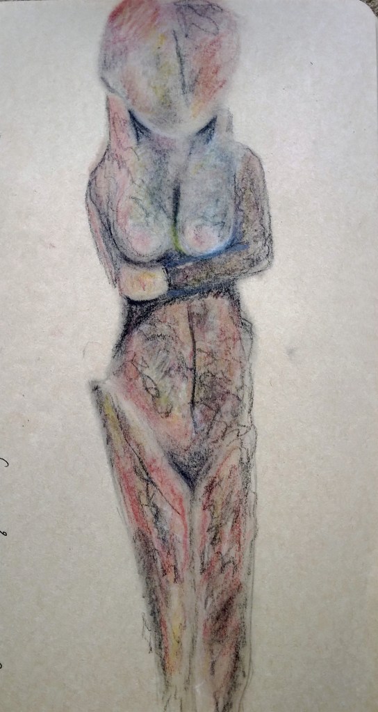
Statuette of a Standing Woman; 3100 – 2900 BCE; Ivory; Egypt ?; Metropolitan Museum of Art. Click here to see actual artwork

Statuette of a Female; Early 1st millennium BCE; Ceramic; Iran. Metropolitan Museum of Art Click here to see actual artwork.

CycladicFigurine of a Steatopygous Female; 1630 – 1539 BCE; Terracotta; Egypt. Brooklyn Museum. Click here to see actual artwork.
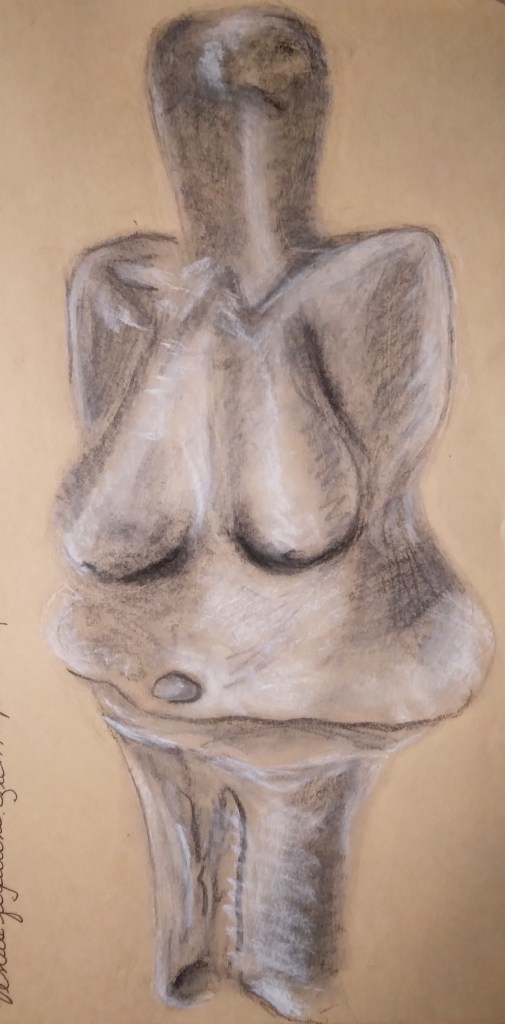
Venus Figurine; Paleolithic; Czech Republic. The Smithsonian. Click here to see actual artwork. This online version of this piece is 3D display which is really fun.
I admit that the first drawing is my favorite so here is a detail view of my favorite part of my favorite drawing – the hands of this figurine.

Detail of first drawing shown
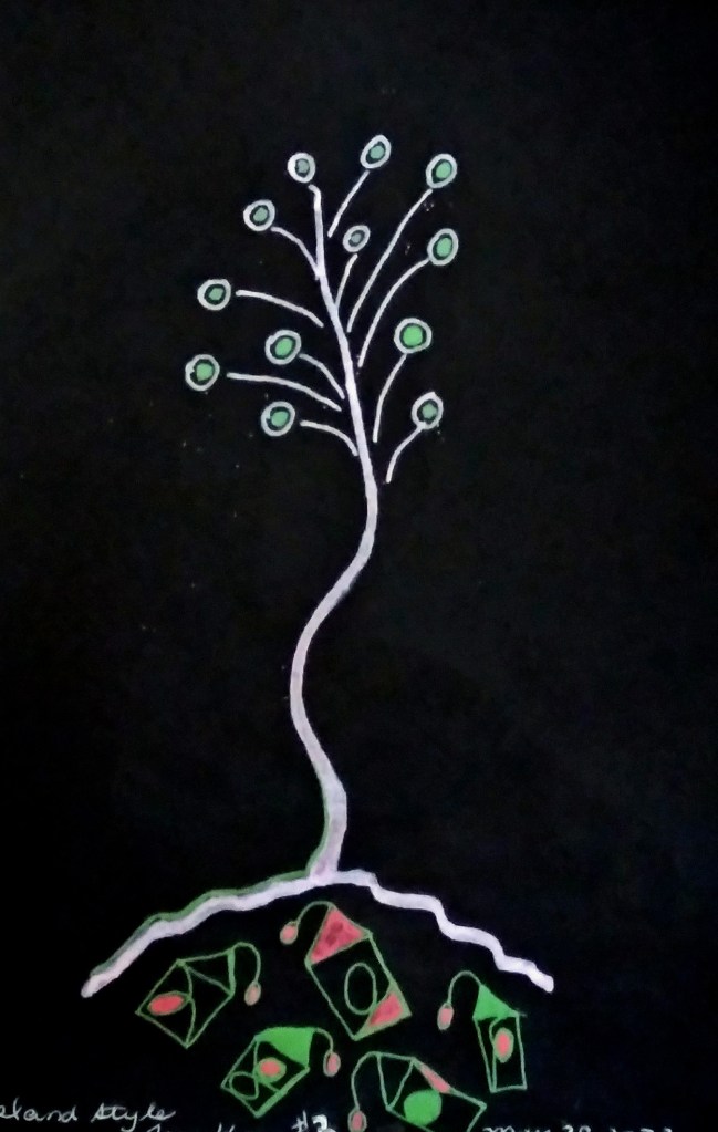
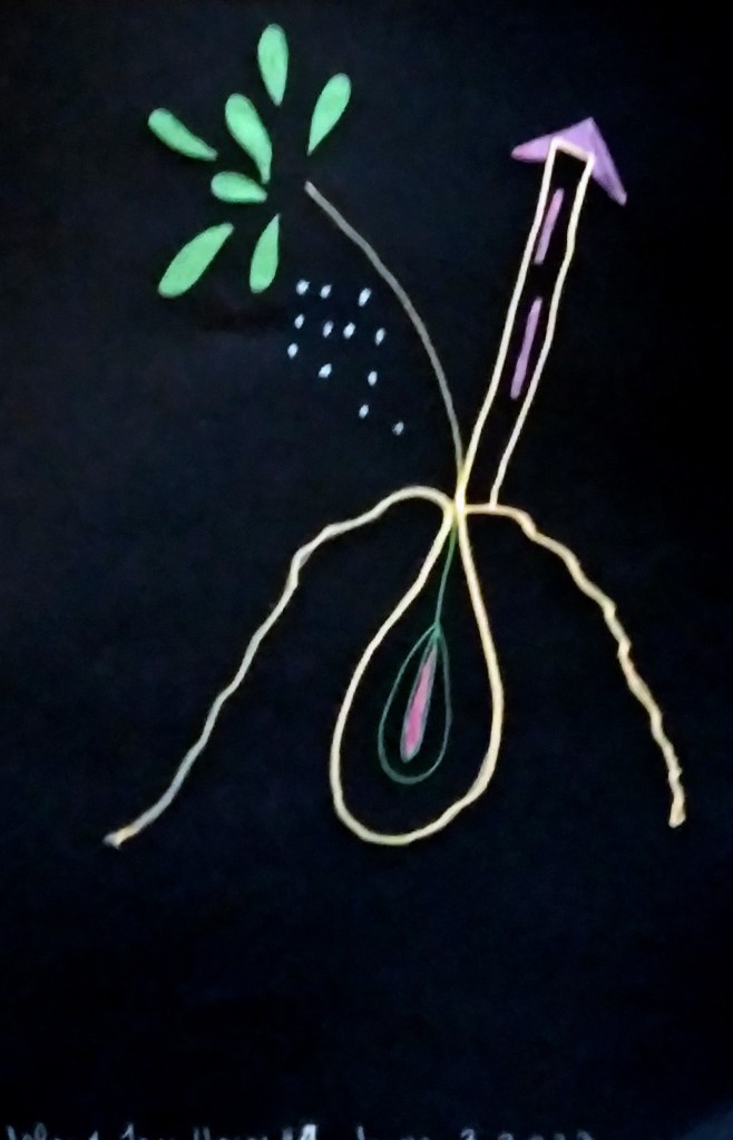
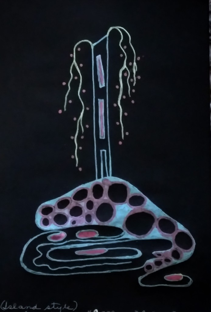
Last month I dedicated lots of time to drawing trees, especially trees with deep cavities where some critter may have taken up residence. Well, I’m not going to be posting those because, frankly, they are nice but not very interesting. Sort of run in the mill everyday tree drawings. But in addition to those I did some make believe trees that also morphed into tree-houses and tree-house-islands. So here they are, starting with the most ‘realistic’. I like that the third one had a tree branch that is antennae like – a standard in most of my work that has houses and buildings.


