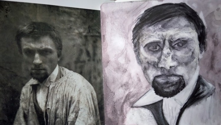
My last post on this topic I talked about how it got started. I have enjoyed reading and looking at the images in this book but it is now time to return it to the library. What I have become absolutely compelled to do was recreate some of the photographic portraits in this book of Rodin and Camille Claudel. Now these portraits are a bit disturbing with the dark sunken eyes, etc. But although we tend to romanticize the lives of artists the fact of the matter is this: it is a very difficult life. And living the time they did, life was difficult for a variety of reasons. So I will start with my favorite portrait from this which is a portrait of Camille Claudel. This photo was taken when she was institutionalized. I will show it below on its own then along with the photo from which it was done.
The next piece is of Rodin, when he was quite young. Again, note the deep set eyes. Made more dramatic by the lighting of the photo.
This last piece is not a portrait but a sculpture. It is a sketch from dry media as opposed to the watercolors above. I am not sure why I choose to cram this into such a small space (a 5 X 8″ sketchbook) but I did and maybe that was part of the challenge along with the very exaggerated angles of this sculpture. I did it from a photograph of the plaster cast. The bronze piece is called Inner Voice (The Muse) and is at the Victoria and Albert Museum but the book lists the cast as Armless Meditation.
The book from which these works were copied is called Rodin, by Masson & Mattiussi, published by Flammarion Musee Rodin.
Sometimes, the most unlikely people sneak into your life and steal your heart. That person for me was my dear friend Mr. Caldwell. Though we had absolutely nothing in common, we made each other laugh and, eventually, were able to talk freely to one another about all subjects.
Mr. Caldwell really never got past that I did not want to “take some of that fat back” home with me to cook with. Nor did he grasp that I had no special way to cook okra, and, in fact, I really never thought of okra until I moved to North Carolina. Quite honestly, when we first met, I don’t even think either of us really understood what the other one was saying!
Actually, there is one thing in our backgrounds that Mr. Caldwell and I did share in common – Ink. Aside from being a farmer, Mr. Caldwell was a production manager at a commercial ink company. As a professional fine art printmaker, I am acquainted with ink and was interested to hear about other types of ink.
I talked about Mr. Caldwell all of the time to my friends and family. Someone asked what he called me and I thought about how he changed his way of addressing me over the eight years we were friends. In fact, I think the various ways he addressed me pretty much sums up the progression of our friendship. So here it goes: Miss Podolsky ~ Miss Diane ~ Diane ~ Honey Child and finally: You Little Runt! (exclamation mark added because it was always said with emphasis). I guess it is a good place to point out that I am barely five feet tall and Mr. Caldwell stood at 6 feet 6 inches.
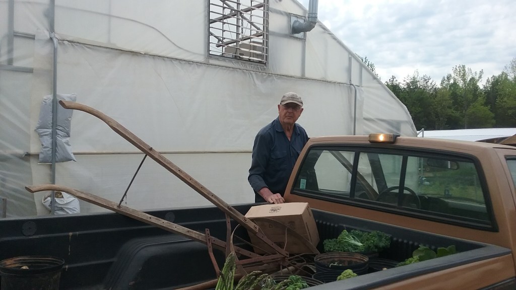
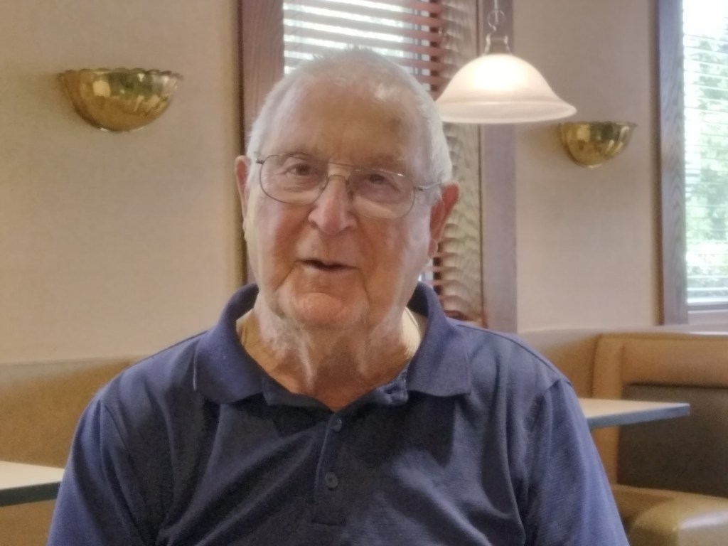
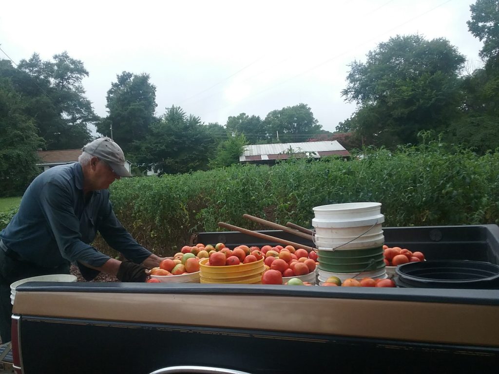
Mr. Caldwell has only been gone a short while. The turnout at his 95th birthday party and his too soon after funeral was a testament to how much he was loved by so many people. So below are a few photographs of my dear friend.
Recently I had the chance to go to my home town of Philadelphia for a few days. My plan was to visit a few places I have not been for awhile, even when I lived there. What came to mind was the Rodin museum. I have no idea why but I had a great desire to go and draw his work. Problem was that the museum was closed the days I would have been there. Ok, there are sculptures outside, in fact, the whole city is filled with public sculpture. Problem again – torrential rain forecasted for several days. Well, I figure I would be around there again in the near future so my project could wait.
Last weekend I recalled that Davidson College had some sculptures I really liked so I would go there. The first thing that attracted me was this very massive dark form. I started with that piece using pencil and charcoal pencil on brown paper. When I was done I looked at the information near the sculpture and it read Homage to Rodin by William Tucker. I thought that was very serendipitous.
Based on a sculpture called Homage to Rodin by William Tucker
A few days later I was in a local public library waiting for my friend Alice and decided to look at the art section. Now this is a culture that places a high value on crafts so most of the books are geared to crafts and any art books are generally geared to instruction. Occasionally I come across something related to art history but it is usually something with mass appeal, such as Impressionism. But there, among the numerous How To selection was a book on… Rodin! It was published by the Rodin museum in Paris and had not only his sculptures but many of his drawings. I was amazed. So with some assistance from the librarian I was able to check out the book and read and draw from it. Below are two drawings I made. The sketchbook is very small 3.5 x 5.5 inches (Stillman & Birn Beta Series). I used watercolor washes and charcoal, graphite and gel pens.
Drawing from Rodin’s Arched Torso of Woman
Drawing from Rodin’s Walking Man
The image at the very top of this post shows the two pieces from the book side by side to try to give a better sense of scale.
An online group through the Plastic Club, an historic artist club in Philadelphia, hosted a paper exchange. I received a pack of hand decorated papers as well as photographs. The idea was to use the papers to make collages. I used the papers in conjunction with things I made or saved. Here they are below.
The papers I received on the work above were the photograph, the little cut out man, and the map. The tomatoes and lake with trees are things I made. The script writing was from something I salvaged from discarded papers.
Do these tomatoes look familiar??? The print of the tomatoes in the tomato cage is mine and the marbled paper is courtesy of the exchange as is the tiny gold flowers (there are 4, see if you can find them!). Since I made the print on white paper, I had to cut out between all those black lines and around the other shapes. Actually it was pretty relaxing to do that. Writing from same source as writing in last collage.
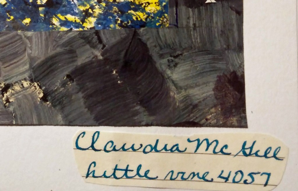
I was not even planning on making another collage yesterday but this one came together very quickly. Sometimes that happens. The fish is mine, the other printed/painted papers from exchange. And the wonderful poem, one of my favorites, is by my friend Claudia McGill. I did credit here on the collage but you can’t see it on this photo. See below. The poem reads:
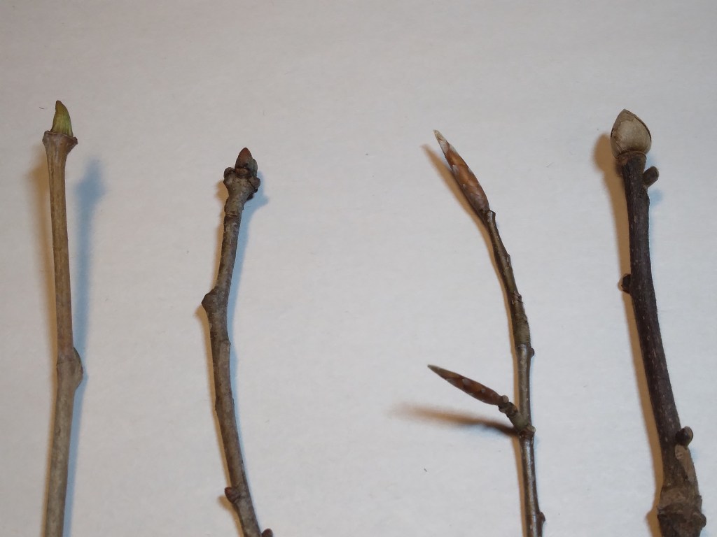
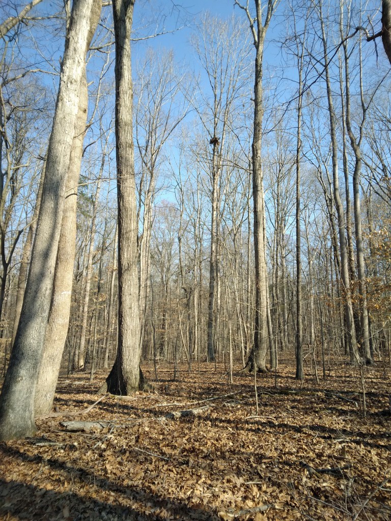
For those of you interested in particular topics on wild plants, but not necessarily everything I post on my Botany Diary blog, I will list the group of posts related to a particular topic when a series is finished. Recently completed was a series called Identifying Trees in Winter. Each of the individual posts are listed below.
Every so often, I remember how fun it is to participate in a print exchange. This year, I choose to participate in the Emerald Print Exchange. The wonderful thing about print exchanges is that the thrill and benefits last long after the exchange ends because you are the recipient of a packet of wonderful prints from who knows where/who.
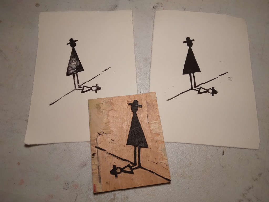
With this project, I decided to continue my minimalism trend of artmaking as a subject for the exchange. I choose one of the drawings I have been making of a person and their shadow/guardian. At some point, I will show these drawings on this blog but for now I am just going to focus on the drawing I choose which is probably the most minimal of all the drawings. To give a sense of scale, the drawing is in a pocket size notebook so the paper is about 3″ x 4″. It is just done with a black gel pen.
Now the interesting thing about this drawing is that is could actually go either way. This is the actual way I drew it but as a nod to the notion of the image’s flexibility, I decided to call the piece Either Or and sign the resulting print in a way where the viewer can decide.
Wanting to experience the full range of choices in printmaking, right from the start I made both a woodblock cut and a dry point/aquatint engraving. Below are the two different plates.
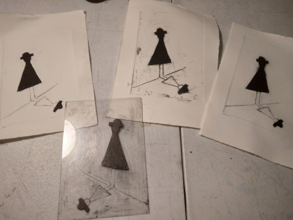
Yesterday the fun really kicked in when I did proofing of both plates. I soon realized that the woodblock would be the better choice for the exchange because it will be less problematic to get consistency with each print pulled. I will explain more of this later in this article. Below are both the results in woodblock (left) and the dry point (right). You can right click on either image to open a larger version.
So the reason the woodblock will be easier to print consistently is because the application of ink is more straightforward – the ink is just rolled on the raised surface and the carved image (barring some sort of odd accident) will retain its original form. For the dry point, the ink is applied then wiped away leaving the ink in the recessed areas. The problem with getting consistency with the dry point is the plate on which the image is made. Traditionally, zinc or copper is used and this is a plastic plate.
With dry point, there is no acid involved. Therefore it is an engraving technique, not an etching technique. The beauty of the dry point is the soft velvety line left from what is called a ‘burr’. In engraving, the tools are made to cut away the burr leaving very fine even lines. With dry point, the tools do not cut away that cleanly so a small bit of metal (the burr) remains on the plate and catches ink. Copper or zinc plates keep their burr for a fairly long time. With the plastic plate, the weight from the press smashes the burr rather quickly so you have to keep going back into the plate and scribing again. This will eventually lead to a very different looking image over the course of times the plate is printed.
Now that I made the decision to use the woodblock, I have to decide if I want to carve another block for a background. I will publish those experiments as I do them. Thanks for printing with me today!
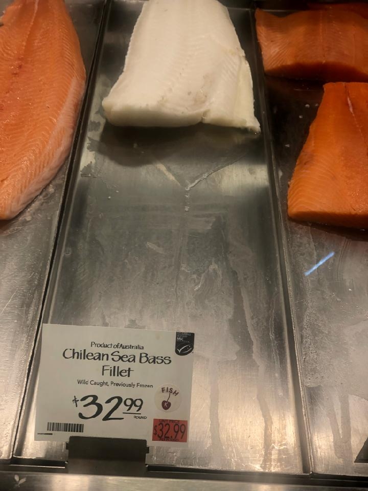
Many years ago, we went to dinner at a restaurant in Chinatown with our friends Mike and Cindy. On the menu, sea bass was listed as ‘market price’. Since Mike was interested in the sea bass, he asked the waiter what it cost. The waiter responded with ‘market price’, which lead Mike to ask what the market price was. The communication/language barrier caused a Whose on First type of scenario.
I don’t remember if Mike ended up getting the sea bass or not, nor do I remember if we ever determined exactly what the market price was that evening. But one thing I do know that came out of that evening which is this: on a fairly regular basis over the next 37 years (and still counting) I have been made aware of what the market price of sea bass was at random times and locations. How did this come about you may wonder? Mike had a job where he traveled quite a bit and he also was a foodie long before such a term existed. So at any given time, he would find himself at a market somewhere or other and report the price of the sea bass to me. Originally I learned this information several days or weeks after the fact but eventually, come the age of cell phones, the market price of sea bass was just a phone call or voice mail away. Now in the age of texting, I will often receive a photo of the fish with the current price. If I had known at the time all this started that I would be getting sea bass updates for the next several decades, I may have kept a log of the information. But I didn’t. So in honor of this bazaar tradition that came about, for the sake of making some permanent record, I am recording the latest sea bass price update in the photo below.
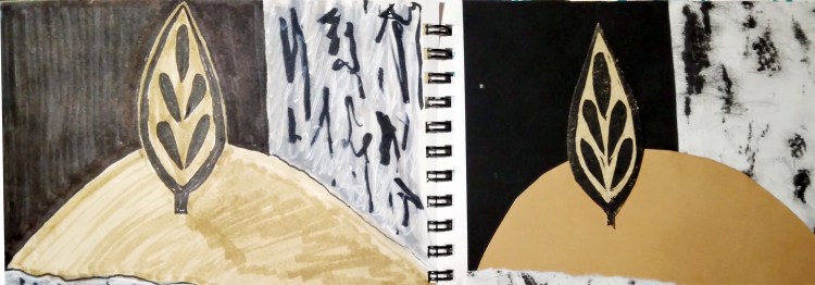
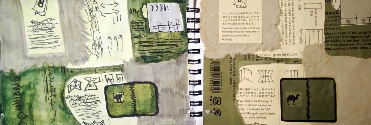
As a quick recap, this little book (4″ x 6″) contains both paper collages and drawings. The collages were originally inspired by a workshop at the National Gallery of Art about the Gees Bend Quilt movement, though I have strayed a bit from that on some collages. In addition, I thought it would be fun to draw the collages after I made them. So the collages are on the right and the drawings are on the left. There are several posts on this project and you can search for more in the box below by putting in “paper quilts”. It seems as though in my haste to get these photographed, I cut off a bit of the right side of some of the collages but I think you will still get the overall idea. By right clicking on any of the images, it will open in another tab and make for better viewing. I will continue to post these as I get a group of images until the book is filled.
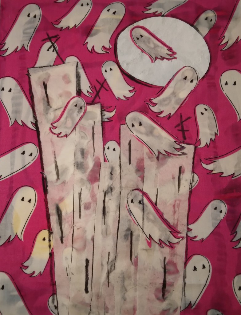
I was taking an online class through the Smithsonian with Marcie Wolfe Hubbard. Our last class involved incorporating a piece of fabric in our work. This was very easy thanks to my friend Claudia who recently gifted me with a very fun piece of fabric that reminded her our our friend Harriet the Elegant Ghost * Here is the result of my efforts using the fabric Claudia sent to me.
*I only linked to one Harriet cartoon. If you enjoy them, you can go to the bottom of my blog and search Harriet and plenty will show up.
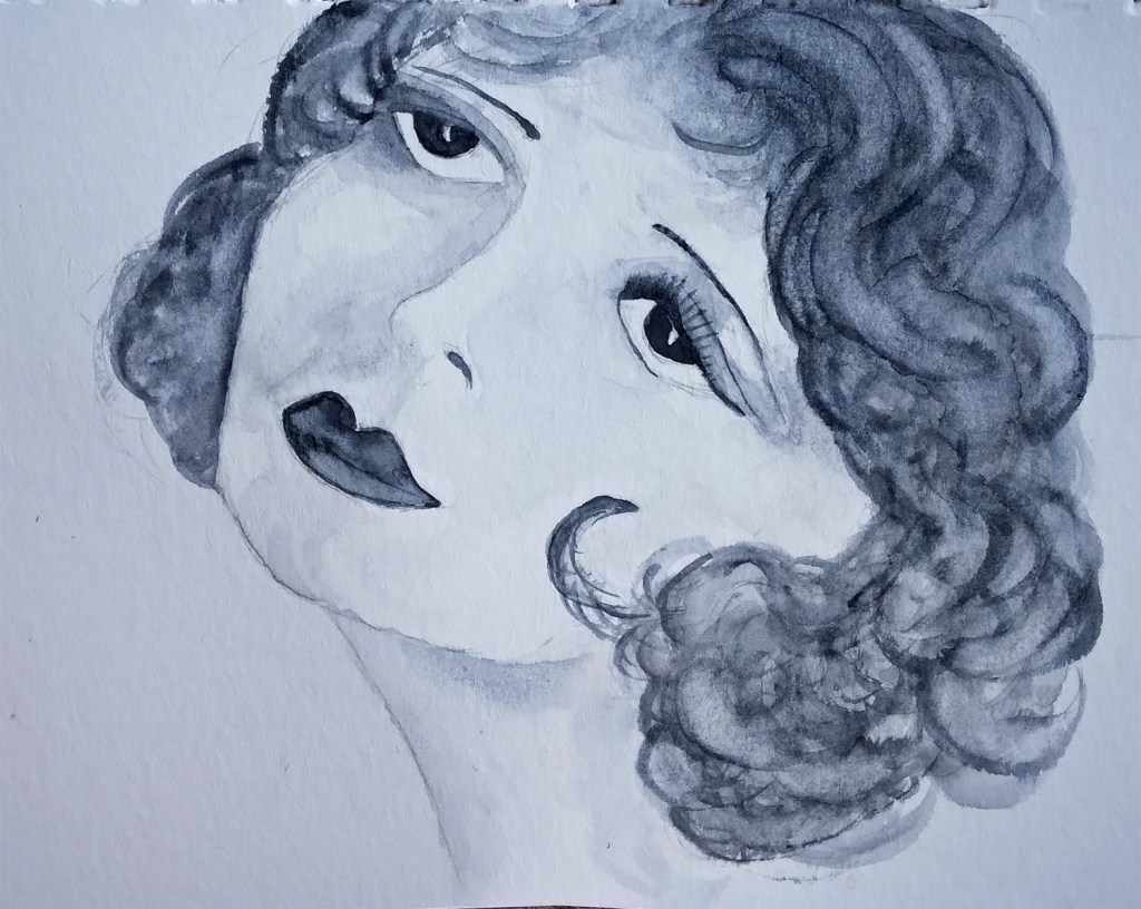
Sometimes it’s fun to go back to basics. Recently I was presented with a choice of images to draw in a workshop. Though I worked with a few of the images, the one that captivated me most was a portrait of the lovely Clara Bow. I have always loved to make full tonal drawings in charcoal but I wanted to challenge myself so I decided to try two different things: one in pencil and one in watercolor. For the pencil one, the challenge was to not overdue it; basically, I was going for economy of line/information. For the watercolor, the challenge was simply using the watercolor. Also, I realized that in the pencil one, her gaze was forward whereas in the image I was using it was looking up so I corrected that in the watercolor. The pencil drawing (left) is larger than the watercolor (right).