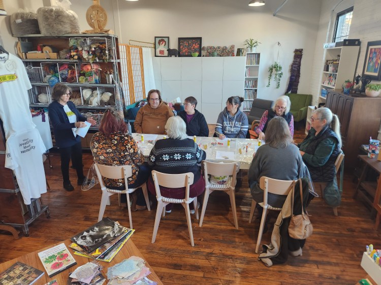
A few weeks back I wrote about a workshop I taught called Books in a Box at the Fabric of Society York. For this post, I will show some images from the workshop and talk a bit about the venue.
What is the Fabric of Society York? (AKA as FOSY) FOSY is a complete fiber arts studio that exists as a space for the community to gather, learn, and create. While it is mostly set up for fiber arts, crafting of all types is encouraged during open craft circle days as well as skill shares (which are the workshops I facilitate). FOSY itself is a haven for anyone who wants to dip their toe in or become proficient in any type of fiber art: sewing, weaving, spinning, crocheting, knitting, etc. Tomorrow evening I am taking a tatting workshop there! They also offer open studio times for people who either need a space to create or simply want to be in a warm lively atmosphere. If you do not own expensive equipment, use of such things are available at FOSY for very reasonable fees.
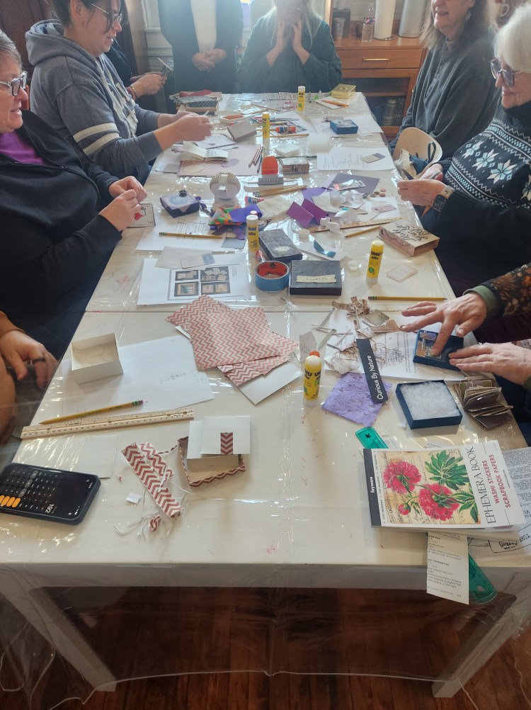
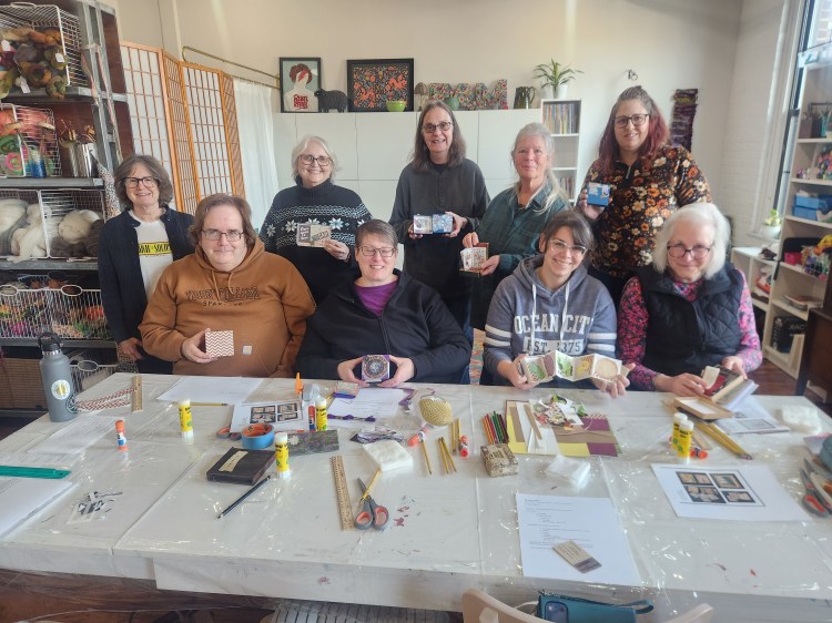
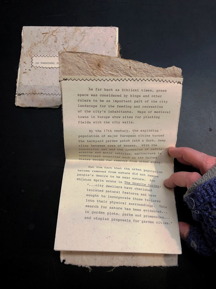
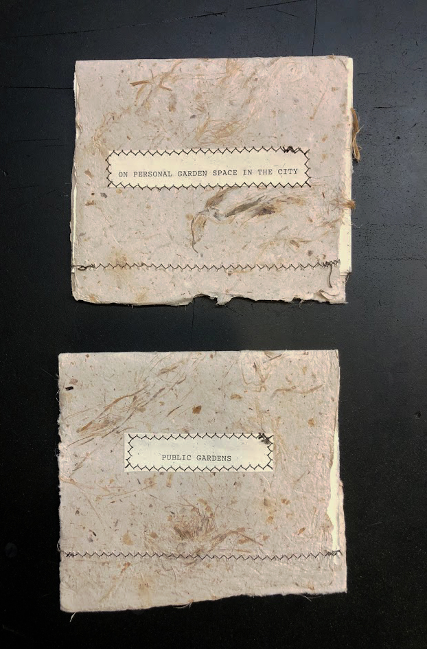
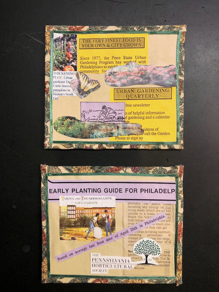
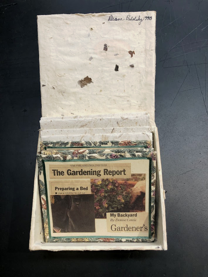
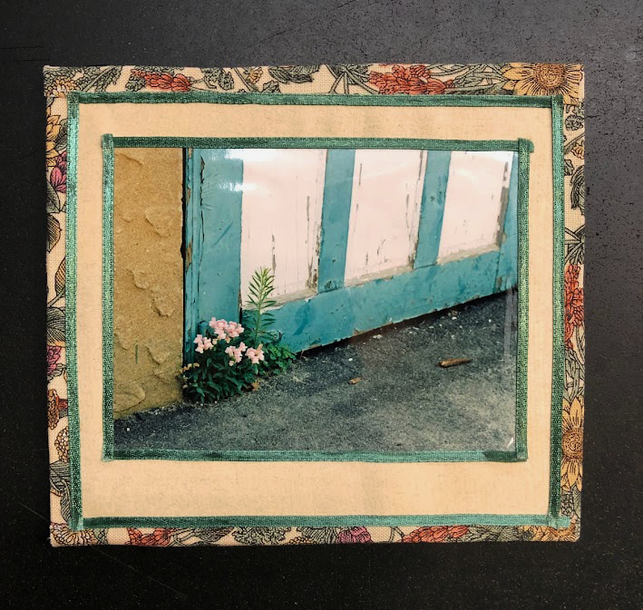
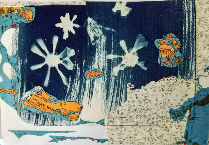
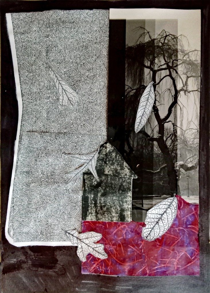
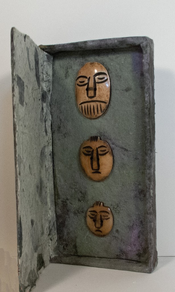
I have facilitated a few workshops at this wonderful venue. The most recent one, Book in a Box challenged attendees to create a book using a box not only to hold the book but to be an integral part of the book. Below is an example of one of my Books in a Box called Contemplation

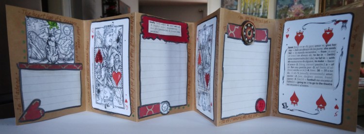
Below is the work created by Robin H. who focused on Valentines Day. The main content is an accordion book housed in a matching box.

And here is the group at work as well as a photo of the group afterwards showing their creations