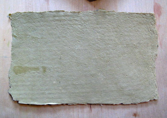
If you have ever had the experience of seeing a really old document, you may notice that the edges look kind of ragged. This is what is called a deckled edge. It is called that because the uneven edge of the paper is formed by the part of the paper mould called the deckle, which is the frame like structure in the photo above.
Handmade western style paper
In my post on making the book Bedtime Story, I had mentioned using a beautiful handmade paper I purchase several years ago. The paper measures approximately 6″ x 8″ but I also needed a few pieces that were about 3″ x 6″. If I were to get out scissors or an Exacto knife, I could easily make a smaller piece of paper but it would like sort of odd with three deckled edges and one straight edge. So how do you go about getting a false decked edge? It is pretty simple but first a bit about paper.
The piece pictured above is western handmade paper. What that means is that the paper has very short fibers. If is also a relatively weak paper compared to Eastern style papers (often misnamed ‘rice’ paper) that are long fiber papers. So the technique I am about to describe works best with western style papers because the short fibers break apart easily when wet.
Preparing paper to make a false deckle
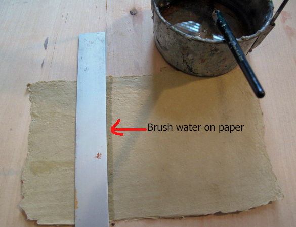
After measuring where you want the edge to be, you take a soft brush soaked with water and brush it along the ruler edge. If the paper is very thick (which was the case with this paper) you need to do this several times until the water soaks through. Then you pick up the paper and very slowly and carefully start to tear from top to bottom. The result is a false deckle that should serve your purpose.
In my last post I talked about a print that was not successful and asked for feedback. One comment I just absolutely loved from my friend Julie was she was struggling with what the girl was holding and thought is was a broken golf club. I busted out laughing and decided that will be the working title for this piece and any follow up efforts. Thanks Julie!
New Working Title: Girl Holding a Broken Golf Club
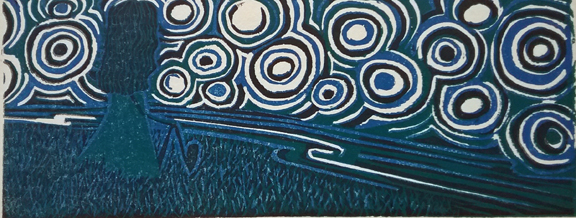
It is important that I share my work that does not come out as planned as well as the work I am happy with. Let’s face it, for every good piece of work, artists (I know this is true for myself) make a few crappy ones. Sometimes I just rework the same thing and other times I abandon the idea altogether or just put it on pause. Below is a print that did not come out the way I had planned and I will talk about how it came to be and why I think it basically is not so hot.
Example of a print that did not come out as planned
The original idea for this is pretty much as pictured, a girl sitting on a hill over a stream looking at a big starry sky. The other things this work originally was going to include were a full moon, then a crescent moon, and a cat. But for some reason, I removed the cat and made a different piece of work with a cat. But that is another story. So I decided the focus should be on the girl.
I also wanted to do a reduction linocut, which is a way to print in color. It has been a long time since I have made one and I wanted to see if I could still register my blocks properly. So what is wrong with this print? Basically, it is too dark. The one I photographed is a bit lighter but in the majority of them the ink is even darker than the one pictured. So I decided to add some hand coloring to see if that perked it up.
Same print with some added hand coloring, but it is still not working for me
It did perk it up a bit but not enough to my liking. So now what? Basically, I love problems like this. I will probably make this piece again as a drawing but I may also cut it again and print it in lighter colors.
The point is this: failure is a great thing. Making art is problem solving. My thoughts are lighter colors but if this was your work, what would you change?
Not long ago after getting tired of sharpening my lino cutting tool every three seconds and still not having it sharp I decided “Enough!” I have been cutting with the same old tools for 30 years and had gotten used to their quirks so much that it never even occurred to me to look for something else. But it did on that wonderful day a week or two ago.
So I called up the wonderful people at McClain’s printmaking supplies and asked a bunch of questions, thought about the information over the weekend, then called back on Monday and placed my order. Today, packaged with great care, were my supplies, some samples of blocks, technical information print outs, and their beautiful catalogue. The catalogue is such a treat because it contains artwork submitted by printmakers from everywhere.
I have come to realize that dealing with specialty stores for something that is really important to you is really the only way to go. Great service and expert advice are priceless. And a bonus: going through he catalogue, I came across one of my linocuts reprinted!
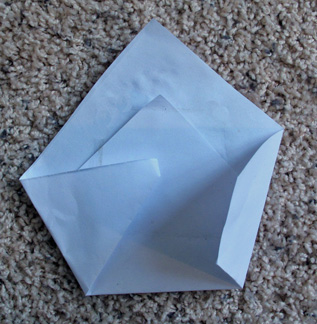
Several months ago, I watched a wonderful video called Between the Folds which went into great and surprising detail on the art of paper folding, also known as origami. The video covers way beyond what we traditionally think of and even gets into how the art form is also being used by scientists to study complicated problems. So of course after the show was over, I got a piece of paper and started to fold it. The form that I liked the most is pictured below. It reminded me of a mother holding a baby.
Experimenting with paper folding
I saw this video not long after visiting my grandson. One of the things I enjoy most about my visits is participating in his elaborate and nurturing bedtime routine. I started to think of lots of parents and their children and bedtime routines, remembering the one we had with our daughter. It quickly came to me that this was the making of a “bedtime story”. So I started to experiment with coloring papers and different types of papers thinking of a quilt like form to play with.
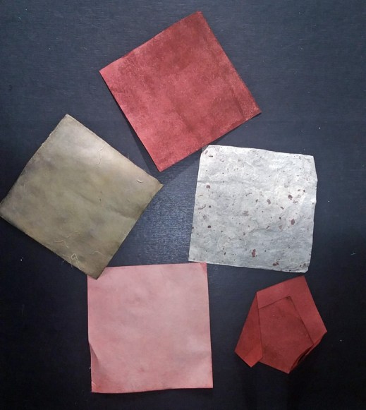
Experimenting with colors
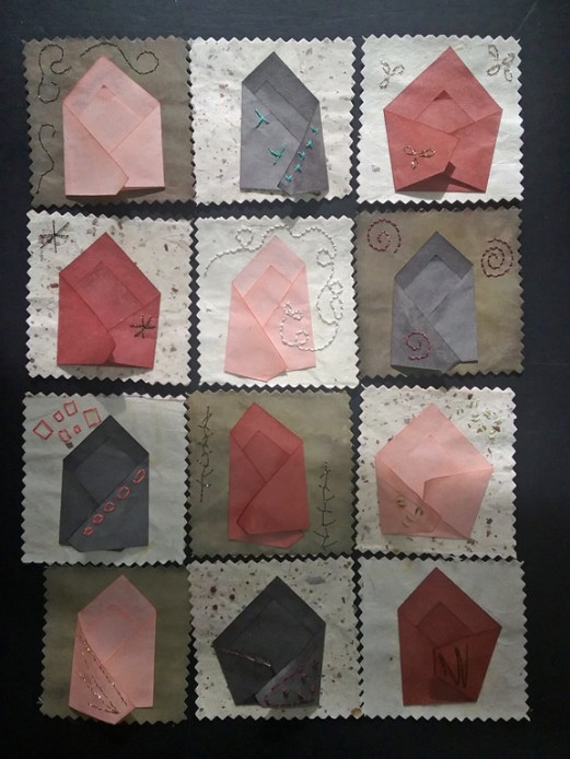
After deciding on the colors I would use and folding a number of the squares, I pieced things together as seen below.
Squares pieced together
While this may look nice, it was clearly not going to work. My overall idea was to have this structure fold up into one square that could be stored in a box, sort of like folding up a quilt and storing it and taking it out when you use it. The other problem was that I wanted to add stitching and it was very difficult to stitch in this form. So after wresting with this for several weeks, putting it away and taking it out to think about it some more, I decided it needed to come apart.
Form now cut apart: what to do next????
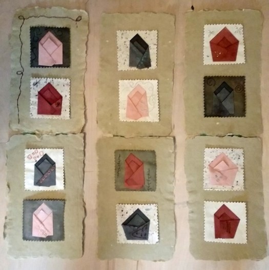
Maybe I am putting too much emphasis on the ‘quilt’ idea and not enough on the ‘story’ idea. Perhaps putting equal emphasis on both: the quilt and the story? I found some handmade paper I purchased a few years ago that spoke to me for no reason except that I knew they would be perfect for something someday. That day came today. So here is the current version of the Bedtime Story, though it is still far from finished. The smaller squares are not yet glued down so this is a layout pictured below. I will post the piece when it is finished. I am also documenting this via short (1 minute) videos on my Instagram account.
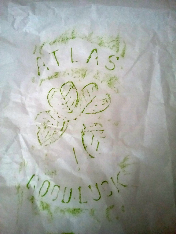
Today, after a very frustrating trip to the store, my friend Alice and I took a socially distant walk together on a local green way. When Alice asked if I would like to walk I said yes but warned her I was not in the best mood. When I met Alice she handed me this print she made by taking a rubbing from an old mason jar. I was delighted to get this and also of her thoughtfulness. Oddly, I just realized as I sat down to write this that not long ago I took a book out of the library on the history of mason jars which is worth looking up if you get a chance. Thanks Alice!
It was great fun to work on this installation in progress at Davidson College with artist Patrick Dougherty. I will take photos of the finished work but here are some of the work in progress. My handiwork consisted of wiring pieces together (see last photo on right) and helping to move stuff. The wiring was more fun that moving stuff! But it all has to get done so all work is helpful. Check out Patrick’s work at other sites.
My friend Tracy is a fantastic wildlife photographer and takes some very exotic trips. She has even had a photograph included in an Audubon calendar. If you love unusual wildlife photos and exotic scenery, I encourage you to check out (and even subscribe) to her blog: https://migratingphotographer.wordpress.com
Last Saturday my husband and I participated in a Jewelry making workshop at a local arts organization. Neither of us are jewelry people but he had his reasons why he thought this would be fun. Also, trying something new is often beneficial, even if the reason why is not immediately apparent.
Paper towels tie dyed with food color
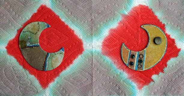
The artist who taught the class, Kim Turner, demonstrated how to use paper towels and food coloring to form the base for a piece of jewelry; sort of low tech tie dying. The idea is, after the paper towel dries, it can be attached to a base (Kim gave us brass shapes that could be turned into necklaces or earrings) and embellished further using the tie-dyed patterns as points of inspiration. The two towels on the left are my husbands; both my towels turned into one color but he managed to keep colors separated. The reason the one towel is smaller is because he used the other half on the brass base. Since many people did turn their creations into necklaces and earrings, there were plenty of things to use for embellishment such as beads, chains, etc. The most popular thing to use were paint pens, especially the metallic ones. Here are our results.
Paper towel based jewelry
At first I was going to turn these into pins (I do like pins). And I still may do that but I also like the look of them mounted on the one paper towel.
Finished pieces with paper towel background
I can see possibilities of using this technique with some high quality paper and watercolor or acrylic wash. I can also see this as a great activity to do with children: meaning the dying the paper towel part. So thanks to Kim and the people at ArtsPlus for making this workshop happen.
Recently I added a few new prints (see above) to my Etsy site that were made via a transfer method. I have been recently thinking about ways to print without a press because so many of the places I taught did not have a press and, in the spring, I will be teaching such a workshop again so I wanted to get back in the swing a bit.
The properties of a transfer print are very different than most printmaking techniques. The marks made are very velvety, sort of more like a charcoal drawing. If you are looking for clean, crisp lines, this is not the method to use.
Materials for a transfer print can be as bare bones as a stamp pad, paper, and pencil. But if you want a little more space for your image I suggest using block printing ink rolled out. Here is what you need:
Block printing ink (I prefer permanent ink)
Paper
An inking slab such as an old baking sheet or a piece of glass or plexiglass
A brayer
Pencil
Cellophane tape or drafting tape
A fine line marker
Watercolor and brush are optional
If you are using a piece of glass please make sure you tape off the edges to avoid cutting yourself. You can see in my photographs below that my glass plate is taped. A heavy tape is best such as duct tape or white artist tape.
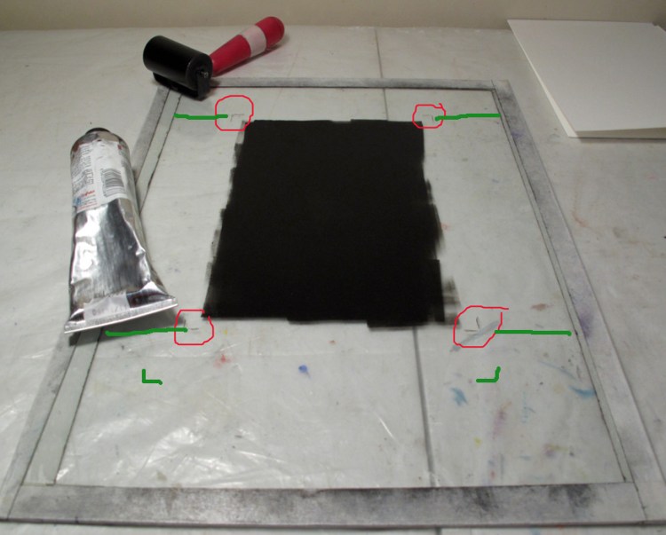
An inked plate with guide marks
Decide how big your image will be. Will is be the size of the whole sheet of paper or do you want the image set in the center of the paper with a clean-ish margin around the image? Keep in mind if you want the latter of the two options you will not get a pristine clean margin like you would with other printmaking techniques but it will have the same effect of setting off the image.
I have marked my plate in the photo above to show both options. Circled in the red marks (this is done via photoshop, it is not on my actual printing plate) there are tic marks made with a marker. This mark is where the ink will go. You do not want to cover the whole plate with ink because it is not only wasteful but will make a mess. This patch of ink is the same size as a small piece of paper I will be using, so the image will cover the whole sheet of paper, no margins. The second marks I made in green (again via photoshop) are for if you want to use a larger sheet of paper with a margin around the image as described above. What you would do is figure out approximately where you want your image to be in relation of the paper (usually in the center). Extend the tic marks out to the edge of your inking sheet so you have indicators as to where the ink is once you put the paper down over it. You will also see a green line on the bottom of the plate, this is also an indicator as to where to lay the paper. With these indicators, you should be able to get your paper pretty close to getting the image in the center of the paper.
For the purpose of this demonstration, I am using a small sheet of paper that covers the entire ink patch (see below). Place the paper down and put some tape on two of the opposite corners. I always prefer drafting tape because it does not rip the paper. However, if you are practicing, use whatever you have handy such as cellophane tape.
Marks made with a variety of tools
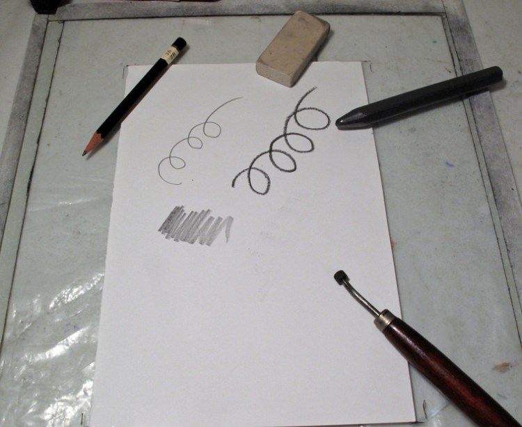
Now you simply draw your design with a pencil. Above I have made marks with a variety of tools: a pencil, a thick graphite stick, the end of an erase, and my fingers. You can also use a pencil on the side, rather than the point, to get a thicker mark. The odd looking tool in the lower right corner is something called a roulette wheel, which is a specialized tool used in intaglio printing. But perhaps you have a pie cutting wheel or some other rolling implement to experiment with; have fun!
Resulting Marks
Going clockwise from top right, here are the results from the various tools: pencil, roulette wheel, dragged finger, finger print, roulette wheel used a different way, fat graphite stick, stamping with end of a plastic eraser. Keep in mind how hard you press will effect the darkness or lightness of the mark. The finger prints were also shown as a warning, whatever you do, do not learn on your paper when drawing because those marks will be picked up. That is why it is a good idea to anchor your paper with tape. If you are using permanent ink, when the print is dry you can go over areas with watercolor.
Paper on ink pad (left), resulting print (right)
So for the quick and easy method, above is the stamp pad set up. Again, I like permanent ink so I use Ranger Ink Pads. With this method, you are limited to the size of the stamp pad. Simply lay your paper down on the pad and draw. Presto!