Embossing by Hand

Embossing Example dark paper
An embossing plate with image embossed on dark paper

Hand embossing, also called blind embossing, is a simple technique that yields elegant results.  I referred to this technique in my last post on McMansions where you can see another example of the medium.

I became interested in embossing 20 something years ago when I came across and ad in the back of a magazine for a pamphlet called Hand Embossing by Pat Condron.  That particular pamphlet discussed a number of techniques and had a decent amount of typeface styles to practice embossing if typeface was your thing.  I tried all the techniques, though I avoided the typeface aspect.  Being of short attention span I settled on what I considered to be the easiest technique, developing even more short cuts over the years to go with my increasingly shorter attention span.
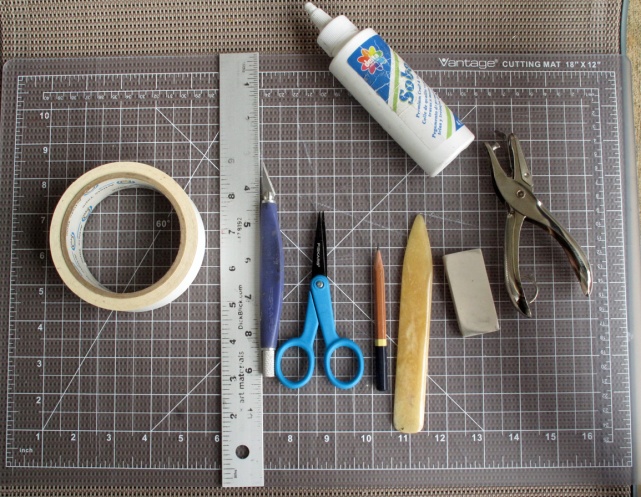
embossing tools
Materials

So to get started, it is good to have some basic materials. Absolutely essential are paper (see list below), card stock, glue, scissors, and a scoring tool (such as the back of a paintbrush).  However, if you really get into embossing obtaining a few more items makes for a better experience:

  • Cutting mat
  • Drafting tape
  • White glue
  • Xacto style knife & blades
  • Ruler or straight edge
  • Small sharp scissors
  • Pencils
  • Eraser
  • Hole punch
  • Paper scoring tool
  • Matte medium & small paint brush
  • Heavyweight card stock (such as bristol board)
  • Paper (lightweight high quality papers look the best such as Rives light sheet, Strathmore 500 series drawing papers)
  • Large spoon

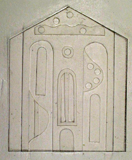
After you decide on an image, when designing the template consider which areas may look good raised and which ones recessed. Since a picture is worth a thousand words, I am just going to post the plate from my last post below and you can also take another look at the plate at the top of this post.
SS Template
Sample of plate showing raised and recessed areas of design

Whether you draw your design directly on the card stock or draw onto tracing paper and transfer your design is completely up to you. I go right for the card stock, figuring that is why erasers were invented, and, since the plate is not the finished piece, who cares if it isn’t pretty?

Ok so now you have drawn and cut out your design. The next step is to glue it onto another piece of card stock.  Make sure the card stock you use to back your design is large enough that your paper fits completely on the plate. You do not want any of the paper hanging off the edge of the plate because you do not want the finished embossed piece to get bent in a way that will detract from the subtle folds and bends of the actual artwork.

Do not over glue because your card stock will warp. You can also put a heavy book on top of the plate while it dries to help keep it flat. While the glue is drying, get your paper for your finished pieces ready, making them all the same size.  When the plate is dry, put a piece of your paper on top of the plate and draw guide lines so you can easily place your paper in the same spot each time you go to emboss.

This next part is optional but I highly recommend it: give the plate a coating with matte medium, making sure not to get any of the medium globbed up in the nooks and crannies of the plate details.  It not only keeps the plate longer, but I think it makes the process of scoring a little easier. You can try it both ways but it is a step I do not avoid.  Of course, this should dry for several hours.

So the plate is dry and you are ready to emboss.  This first piece will serve as a practice piece and a reference guide/map. Make sure your surface, your hands, and your tools are clean. Lay your first sheet of paper on the plate at the guidelines your drew. Attach a small piece of drafting tape so the paper doesn’t move.  Gently rub the paper with the back of a large spoon to get the basic shape of the overall design.

Take your paper scoring tool and, using the tip, run the tool slowly along any straight edges. Start with straight edges because they are the easiest. Then go to any rounded edges and slowly run the tool against those edges with the point of the tool. If it makes it easier for you to turn your plate as you work, then do so.  When you feel you have finished scoring every aspect of your design gently lift off the paper and examine your finished piece. Since this is a practice piece, if you missed anything, try to align the paper back on your plate and go over that area you missed. Afterwards, whether you missed an area or not, use this piece as a map/guide so you know what areas need scoring for the rest of the edition of prints. Having this map/guide eliminates any guesswork hereafter.

Old Embossing 1993
Embossing from 1993

Above is one of the first embossed pieces I made, from 1993. I still have this piece so you can see how long these images last. There is one difference in this piece and that is the paper color and stock.  This was done on Arches Cover Stock, that I put a wash of paint on first. I believe I did most of these as a dry embossing, as described above, but I feel I may have done some as a “damp” embossing as well.  The difference is that the paper is slightly damp when you score it. This may be useful for a thicker paper stock (such as Arches Cover) but it is not necessary and, frankly, I do not like it because the paper stretches. However, if you do choose a damp paper method, it is then absolutely essential that you treat your plate with matte medium to keep it from warping.

If you are going to sign your finished work, it is best to do so on the back with pencil because any mark detracts from the overall subtle design. So that is embossing in a nutshell.


New Work: Suburban Sprawl (the McMansions)

SS
Suburban Sprawl, 2019, Artist Book, Hand Embossed

Before I get into why I made this piece I will give my definition of a McMansion.  A McMansion is an excessively large home on a lot that is way too small and contains an over abundance of architectural features that often compete with one another.  I do not know anyone who lives in this type of housing but there seems to be a great deal of it being built in “up and coming” areas; therefore, I am bound to meet someone sooner or later who lives in one and piss them off if they ever read this.

SS Detail
Suburban Sprawl, detail

Though I have long been aware of the McMansion (see this early post), it was not until I lived in a suburban area where there is a serious shortage of affordable housing and I could witness first hand the destruction of important habitat, that the McMansion really made a serious impact on my thinking.  So the McMansion became a scapegoat as my way of raising concern on the issues of over development and the shortage of affordable housing.

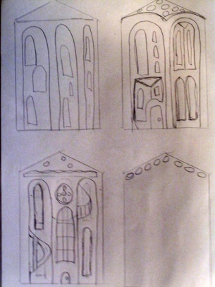
ss Sketches
McMansion sketches

I choose the format and the medium very deliberately.  First and foremost is the house shape, something I use often in my work. But the look of the house could not be the standard few windows and door that I often depict. The features had to be exaggerated so I made several sketches based on things I had seen.  Then there was the number of houses, which I decided to be 25 for no reason except it seems like enough to create the “sprawling” I felt was necessary to convey the loss of land (and I knew I could reasonably make 25 houses without pulling my hair out).  I connected the houses to emphasize the lack of a suitable plot of land for such a large house.


Lastly, I choose to use blind embossing to emphasize the absence of any personal

SS Template
Blind embossing plate

ornamentation, interesting garden or yard features. Ironically, blind embossing is often a medium I equate with elegance and simplicity but it seems to work more in this case within the context of banality.   A blind embossing is made with a cardboard plate. Paper is places on top of the plate and hand scored along the relief shapes.   It is an underused medium and I do intend to write up a bit more about the medium itself in the very near future.

So I “feature”, or more accurately poke fun at, the McMansion as  my newest piece relating to home, housing, and community.

American Beech Tree: Romance Recorded

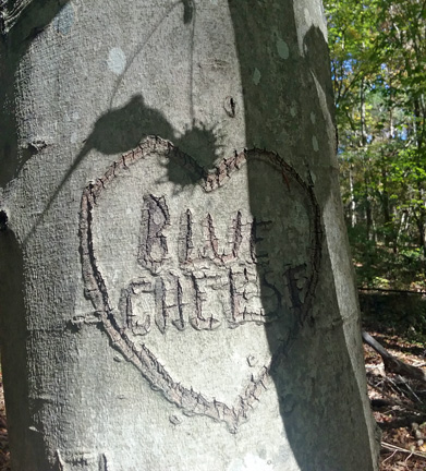
Blue Cheese

As much as it pains me to see a tree defaced in anyway, I could hardly argue with the sentiments left in this message!  The very smooth bark of the American Beech Tree (Fagus grandifolia) lends itself to whims of any passerby with a knife and a need to proclaim their love for someone else, or in this case, something else.  As a result, the American Beech is nicknamed the Love Letter Tree.  The next time you are on a walk and you see a tree trunk proclaiming the love of numerous couples, more than likely it is a Beech tree.

Beech trees are fairly easy to identify.  First, there is the smooth light grey bark. Their leaves are altBeech Leavesernate (not in pairs), somewhat oval, with a toothed edge. The veins of the leaves coming from the midrib (the main vein going up the center of the leave) end at the point of each tooth. 

There is another interesting thing about Beech trees; they tend to hold their leaves in the winter, even though they are a deciduous tree (a tree that drops its leaves). However, the leaves are quite dead.  This struck me funny because I had not noticed this when I lived further north.   This is something that can happen when conditions have not allowed the development of tissue that closes off the spot where the leave’s stem meets the branch.  It can also occur in young trees, which is why I think I do not remember seeing it where I used to live because the forests were much older than the ones where I currently live.

Anyway, unlike the many recorded initials of couples probably long broken up, I am fairly sure that the author of the love affair with blue cheese is still going strong.

Cookie Cutter House Project Summary

The Neighborhood 72
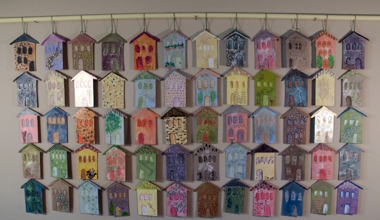
The Neighborhood, 2019

I began the Cookie Cutter House Project early in 2018.  Though I have long been obsessed with the image of houses and buildings in my work, the act of relocating added another aspect to my thoughts on the topic of housing and community.  I started to make paintings and artist books on the topic.  I also wrote several blog posts on topics related to housing and local culture. Then it dawned on me that it might be fun and useful to learn what other people consider to be the idea of Home

I invited many art enthusiasts to participate in an on-line exhibition. Each participant was sent a set of identical house shapes measuring approximately 9″ x 6″. Using at least one of those house shapes, the artist depicted her/his idea of What Is Home and wrote a few lines about their thoughts on the topic. Each participant’s entry was then featured on this blog.  All together, 18 artists from different parts of the US and Canada participated.  Links to the individual artist’s posts are below.

In addition to the on-line exhibition, here are links to some of the current work I created for this project. I will add more as they are available.

Here are a few blogposts related to the overall theme of this project, including very early work featuring houses and buildings.

Minimalism is Also a State of Mind

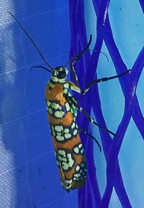
Ailanthus webworm mothThere seems to be endless information around telling people how to live a minimalist life by getting rid of things they don’t need.  But here is the thing, minimalism, true minimalism, is not only about “things” but a state of mind. Below are some examples of what I am talking about.
Over the past year, a dear friend of mine was accepted into a very prestigious painting competition that lasted over a week at a small resort area. She worked very hard preparing for this event, not only honing her skills but preparing materials and visiting the location ahead of time.

At the end of the event, it was everything she imagined and more.  She had a wonderful time, learned a great deal, met lovely people, and was honored and humbled to have had such an experience.  And she said she would not do it again.  Huh???  This is the complete opposite of the more typical thought “I hope I can do this again”.  Basically, she had other things she would like to do.   It takes a lot of examination of self to make such a decision.  A minimalist mindset is knowing when enough is enough.

Above is a photograph of a moth.  Moths are way overlooked because their relatives, the butterflies, are perceived to be “more beautiful”. For the past three years I have participated in a national moth inventory. Going out into the woods at night and taking a close look at these tiny underappreciated insects has been great fun and very eye opening to see the array of colors and patterns on these creatures.  A minimalist mindset is taking the time to take a look at what is often overlooked.


Expanding on the Theme of Over Development

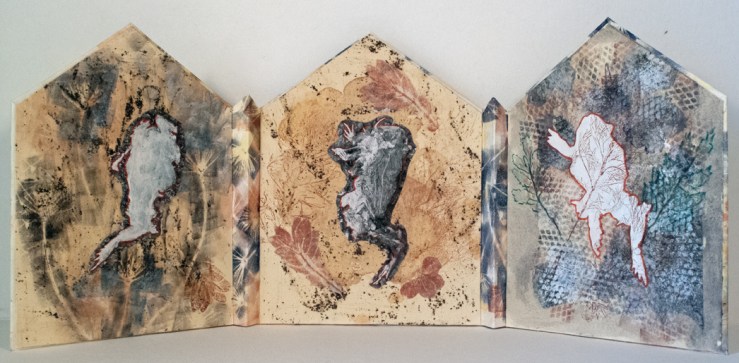
The Fallen
The Fallen, 2019, Mixed Media Artist Book, Unique, 7.25″ x 17″ Open,


The Fallen Back View
The Fallen, 2019, Mixed Media Artist Book, Unique, 7.25″ x 17″ Back View Open,
The Fallen Closed 300
The Fallen, 2019, Mixed Media Artist Book, Unique, 7.25″ x 5.5″ X 1″ Closed

Awhile back I posted digital images I worked over along with some thoughts on over development.   Since then, I have decided to expand on the theme and construct an actual physical piece.  The Fallen pays tribute to all creatures that are victims of over development but I continued to use the image of the toad.  I choose a triple panel structure that is reminiscent of alter pieces and deliberately used a house shape as the panel format.  I repeated the use of the red outline of the toads’ bodies as I did with the digital images. If you did not see the original post with the digitally reworked images, you can see that here .

Should Art Match Your Sofa?

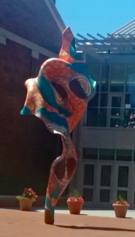
Wind Sculpture, 2018 by Yinka Shonibare
Wind Sculpture by Yinka Shonibare, an example of a well placed  work of art.

The age old indignation of someone holding a fabric swatch up to a piece of art is something many artists endure.  I was reminded of this lately when rewatching Hannah and Her Sisters when the character Frederick, an artist, becomes outraged when a potential client wants to consult his decorator before buying. So let me pose this question: Don’t we owe it to a piece of artwork to place it in the most beneficial setting?  Let’s talk about this a little more.

Recently, I became aware of several well meaning community based public art projects where artists, often sculptors, are awarded public space to show their work outdoors for a specific period of time.  This is a wonderful benefit to the community and the artists but often not a benefit to the artworks.  A small public park not far from where I currently live has such a program. The artworks chosen are well crafted and have a broad aesthetic appeal but look as though they were unloaded any old place on the green space giving the impression of a yard sale more than an outdoor gallery.

Similar things can occur even in the most professional public sculpture program.  My hometown of Philadelphia has a world class public sculpture collection that takes great pains to place the works.  The problem is as the cityscape changes due to construction or myriad other things that can affect a location, the sculptures may no longer be presented in the best way.  And in a city the size of Philadelphia, the logistics involved in moving a piece of public sculpture to a new location can take years.

Now all the talk so far has been about three dimensional art so let’s talk about two dimensional art.  Let’s face it, when you buy something to perk up your spirits, you are not going to plop it just any old place; you are going to put thought into it.  We do this with furniture, lighting, media, decoration, & family photographs. So who are we kidding when we pretend we are not going to do the same thing with a painting?  I had the fortunate experience of studying at the Barnes Foundation. Dr. Barnes had a very unique way of displaying his collection.  It was if everything on any given wall, when viewed all together, created another whole picture in and of itself.  Symmetry was important, as well as size and shape of the painting but it did not stop there. Even elements withing each painting were considered: color, shapes, lines, etc.  Dr. Barnes’ presentation of his painting collection also broke the rules by including furniture and other objects mixed within the painting display.  These furnishing and objects also had to have elements that enhanced and blended with the paintings.  If you have never been to the Barnes foundation, I urge you to go on their website where there are often photographs of the galleries. The link highlighted takes you directly to their collection but look around the site for photographs of full gallery shots.

Lastly, I will talk about a public sculpture that I think is beautifully placed. The piece is called Wind Sculpture by Yinka Shonibare. Whether you like the piece or not is not really relevant to the points I am going to make so please don’t zone out yet.  This sculpture is

Sculpture placement
Wind Sculpture in a larger view of its setting on the grounds of Davidson College

on the grounds of Davidson College which was founded in 1837. First note that Wind Song is a contemporary piece of art with regard to era, feel, and materials so it works well with one of the college’s newer buildings. Think for a moment what this sculpture might look like if it were in front of a building from the early 20th century.  The organic, curving lines of the piece are a nice contrast to the geometric lines of the building.  The colors of the sculpture are both warm (the browns, oranges, earth tones) and cool (the blues) just like the colors of the building (bricks – warm, glass/chrome – cool).  The ample space around the sculpture allows for it to be viewed at a number of angels.  Basically, it blends just enough to seem a natural part of the environment but stands out just enough to add some interest to the open space.

So maybe it is ok if the painting you buy matches your sofa. And if it doesn’t, that’s ok too but make sure you place it with care.

More Cookie Cutter House Artwork

Little-Pink-Houses
Little Pink Houses, 2017, Acrylic & Graphite on Panel, 12″ x 12″

This first painting, Little Pink Houses, was the first piece I finished for this project.  I have posted the image before but never wrote anything about the work and there is a good reason for that.  Often, it takes time before I realize why I made something.  When I first finished this painting, I thought it stood for suburbia, something I was not really familiar with until recently.  Well it does stand for suburbia, but not the suburbia of today where the HOA oversees your life (you can read my thoughts on this topic in my post No Pink Flamingos).  This is the suburbia of the past, when you could enjoy your yard, hang you clothes out to dry, and do the other types of activities that make home ownership a pleasure.

Ghosts-of-Neighborhoods-Past
Ghosts of Neighborhoods Past, 2018, Acrylic & Graphite on Panel, 12″ x 12″

The work above, Ghosts of Neighborhoods Past, is about neighborhoods that have seen better days. Unfortunately, this is my old neighborhood.

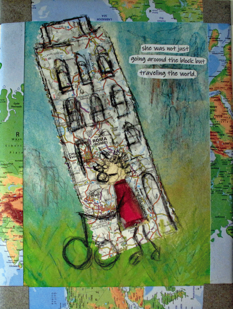
A Walk Around the World

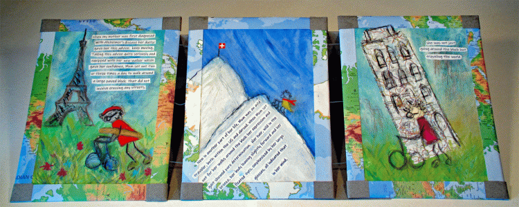
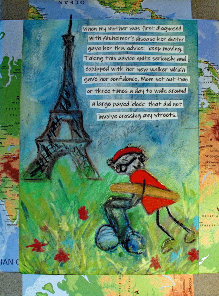
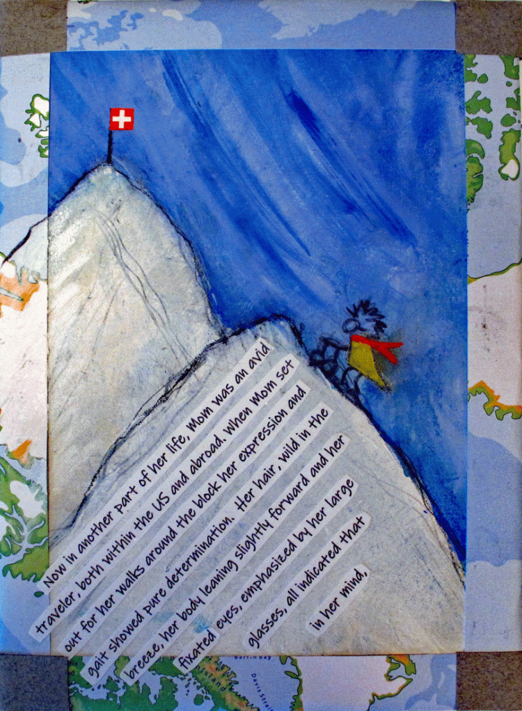
This book was started some time ago but I did not like the way it was progressing so I put it away to work on “in the future”. Well, the future came and here is the finished book. It is a fond memory of my mother. Each panel is shown enlarged so the text and illustrations are easier to see and read.

A-Walk-Around-the-World

A Walk Around the World, Mixed Media Artist Book, 9″ x 21.5″

Paris

Alps

Italy
A Walk Around the World, Panels 1, 2, & 3.


The Neighborhood: Completed Artwork

The Neighborhood 72
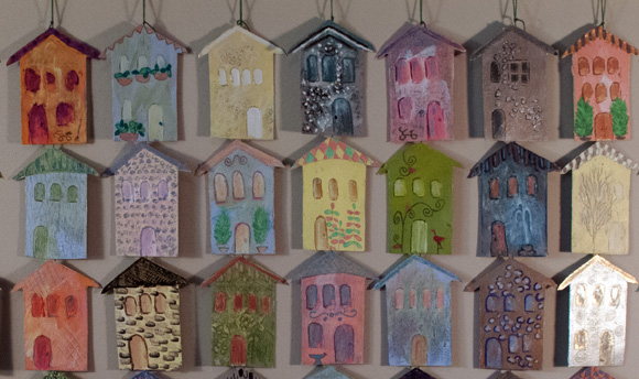
The Neighborhood, 2019, Mixed Media Installation, 21″ x 47″

So here is the finished work.  Thank you all for your comments on the last post of this as it was in progress. I decided on a horizontal format and it is currently hanging on a dowel which I have come to realize is a quick answer to hanging most artwork that is not framed. An earlier version of this piece can be seen by clicking here.

There are a few things I would like to talk about. On the detailed image below, I want to bring attention to the house on the bottom row in the middle. My goal with this house was to try to get a very old world structure with a fountain out front.  This may seem a bit of a stretch on a row house but many people take great pride in making their small row homes seem grand by mimicking old world style architectural features. I am not making fun of this, I find it very charming. This can also apply to the house in the upper right with the two large planters flanking the door and the several houses throughout the installation piece with the faux stone fronts.  More traditional for row homes are bicycles out front as in the house in the upper left, fire escapes (see Detail 2, upper right) and small trees, climbing vines and lawn ornaments (flamingos).  You get the idea.  Though row homes, like town homes, are traditionally attached, that was where I took some artistic license with this.  My hope is that the closeness and the quirky nature of each home speaks to the culture of row house living.

The Neighborhood detail 72
The Neighborhood, detail