I was searching for images in the public domain to show during a talk I was going to give on the element of shape in art. It dawned on me that the ‘go to’ is always paintings and I got to thinking that sculpture would be so much more fun for exploring shape. Many of the sculptural images in the public domain are from ancient times and when looking at them, I was reminded of the many times I visited the African Art galleries at the Metropolitan Museum of Art with my friend and former history professor, Father Ed Biggane. Ed lived in Africa for many years and collected African sculpture. Upon his death, I heard many of his pieces were donated to a museum collection. As I looked at these images, which were from all over the ancient world, I was struck by the unusual shapes, their beauty, their simplicity….I could go on and on. So I decided to start drawing them. Below are a group of drawings I completed recently. The links to the artifacts are included so you can see the actual works if you desire. And I must add that walking around those galleries with Ed must have made an impression on me and I am grateful to him for opening my eyes to such unique art.

Standing Female Figurine; Greek, Rhodian (?); Early 5th century BCE; Terracotta. Metropolitan Museum of Art. Click here to see actual artwork

Marble Female Figurine; Attrib. Bastis master; 2600-2400 BCE; Metropolitan Museum of Art Click here to see actual artwork.

Marble Female Figurine; Cycladic; 4500 – 4000 BCE; Metropolitan Museum of Art; Click here to see actual artwork.
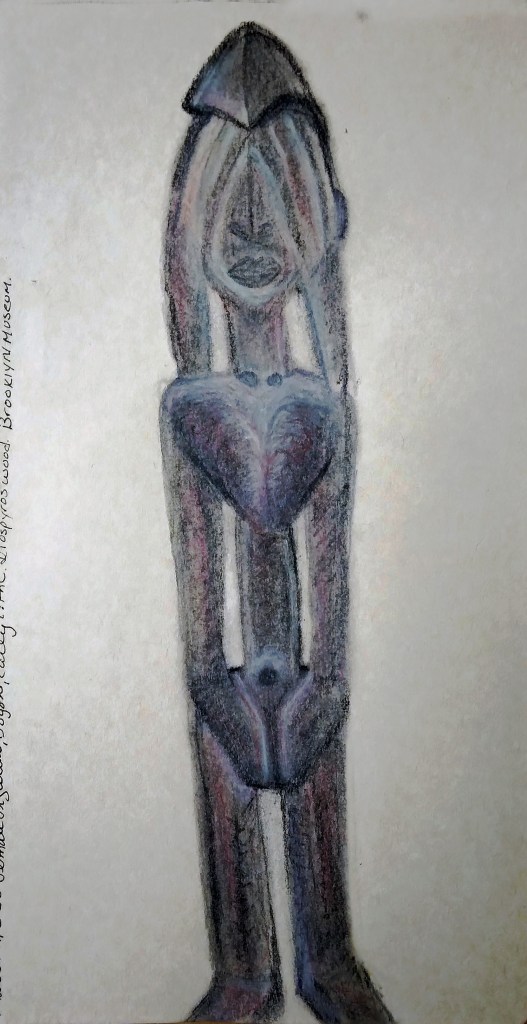
Female Figurine, Dogon, Early 17th Century, Diospyros wood, Brooklyn Museum; Click here to see actual artwork.
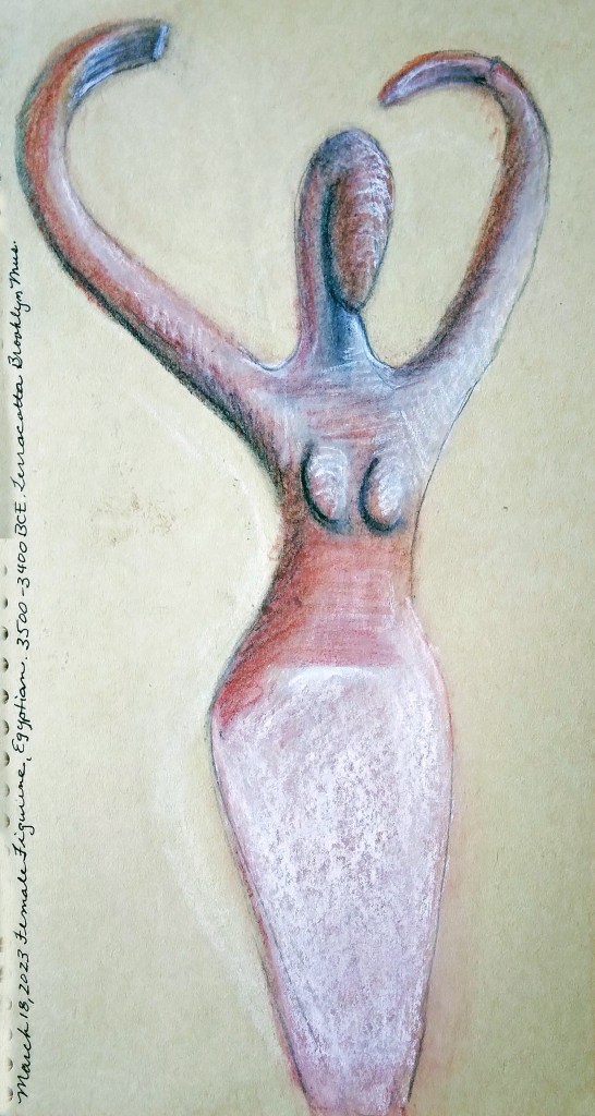
Female Figurine; Egyptian; 3500-3400 BCE; Terracotta; Brooklyn Museum; Click here to see actual artwork.
*******
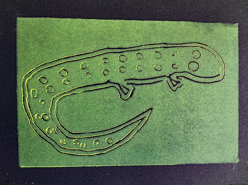
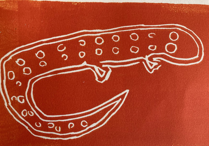
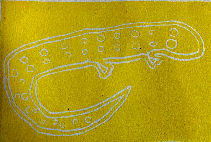
These images were drawn using a combination of conte crayon and a variety of pencils in a brown paper (craft paper) Traveler’s Spiral Bound Sketchbook, approx. 8″ x 5″